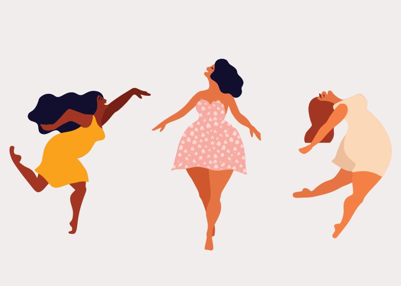
By mixing the nuances of the different "light" and "dark" families of colors, you can really get always different optical effects, adapting your mood to the image with which you want to meet in the mirror. A leading role is played by harmony: there are colors that go well together, which give each other strength, and which combined give off an extraordinary energy!
It may be interesting then, to tell some principles of armocromia , the discipline that studies chromatic harmony, defining the colors that enhance the natural tones of the complexions.
1. MATCHING THE COLORS FOLLOWING THE ITTEN CIRCLE: Why not try?
In fashion, as in art, there are various ways of associating colors in relation to the chromatic circle of Itten , in which they are combined according to two main guidelines: gradations and contrasts. < / p>
The color circle corresponds to the color scale. The PRIMARY colors are represented in the central triangle: blue, magenta red, yellow. The SECONDARY ones are: green, orange and purple, which derive from the union, according to various percentages, of the three primary colors. TERTIARY colors are in the outer circle, in correspondence with the primary and secondary colors.
To better understand how color matching works, also with regards to clothing, we must first of all take into account a personal choice: we prefer a combination of contrasting colors, with a decisive and lively result, or we are more by combination by gradations, or harmonious and delicate?
Having made this decision, we can obtain the two combinations as follows:
• Color matching by contrast: consists of associating two colors in the opposite position on the chromatic circle, such as blue and orange, or red and green.
• Color matching by gradation: corresponds to the association of colors very close to each other on the color circle, such as yellow and orange, but also blue and blue. In short, in combining different shades of the same color.
The circle, however, takes into account only the primary and secondary colors, leaving out the "non-colors" (white and black). How to regulate ourselves, then?
We can certainly consider that:
the WHITE tends to accentuate the shapes, to radiate light, for this reason it is the easiest color to combine, both with pastel and neutral shades, and with warmer combinations, such as red and orange.
BLACK , it goes well with practically everything. In particular, the brighter colors, combined with black, give overwhelming effects from the point of view of light, but also pastel colors and natures draw great intensity from them.
Also as regards the complexion we can play to identify those color combinations that highlight their brightness and hue, avoiding the combinations that turn off the face or do not stand out our skin.
An olive complexion, for example, with dark hair, will shine with shades like pink and orange, red and black, almond green, beige, plum!
A more ethereal complexion with dark or brown hair will be illuminated by shades of beige and white, navy blue, yellow, ivory; or an angelic complexion with blond hair, could choose intensity with colors such as chocolate and red, khaki, camel color, or wisteria, lavender color ...
But how do you really do, to always feel your best? Well, there is only one trick, actually, to dispel any doubts:


